© 2023, Rinchong Kim
Seoul, South Korea
All rights reserved.
Concept Proposal UX/UI April 15, 2022

Seoul Bike App Design Proposal

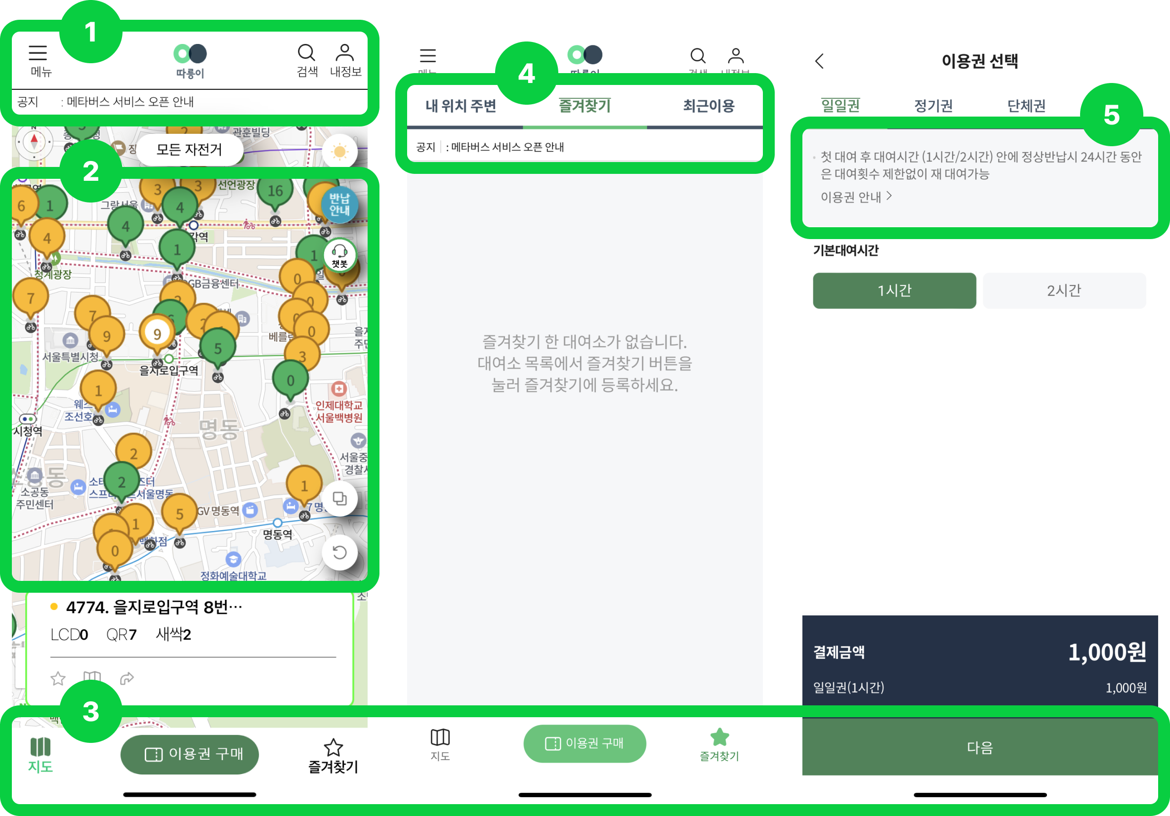
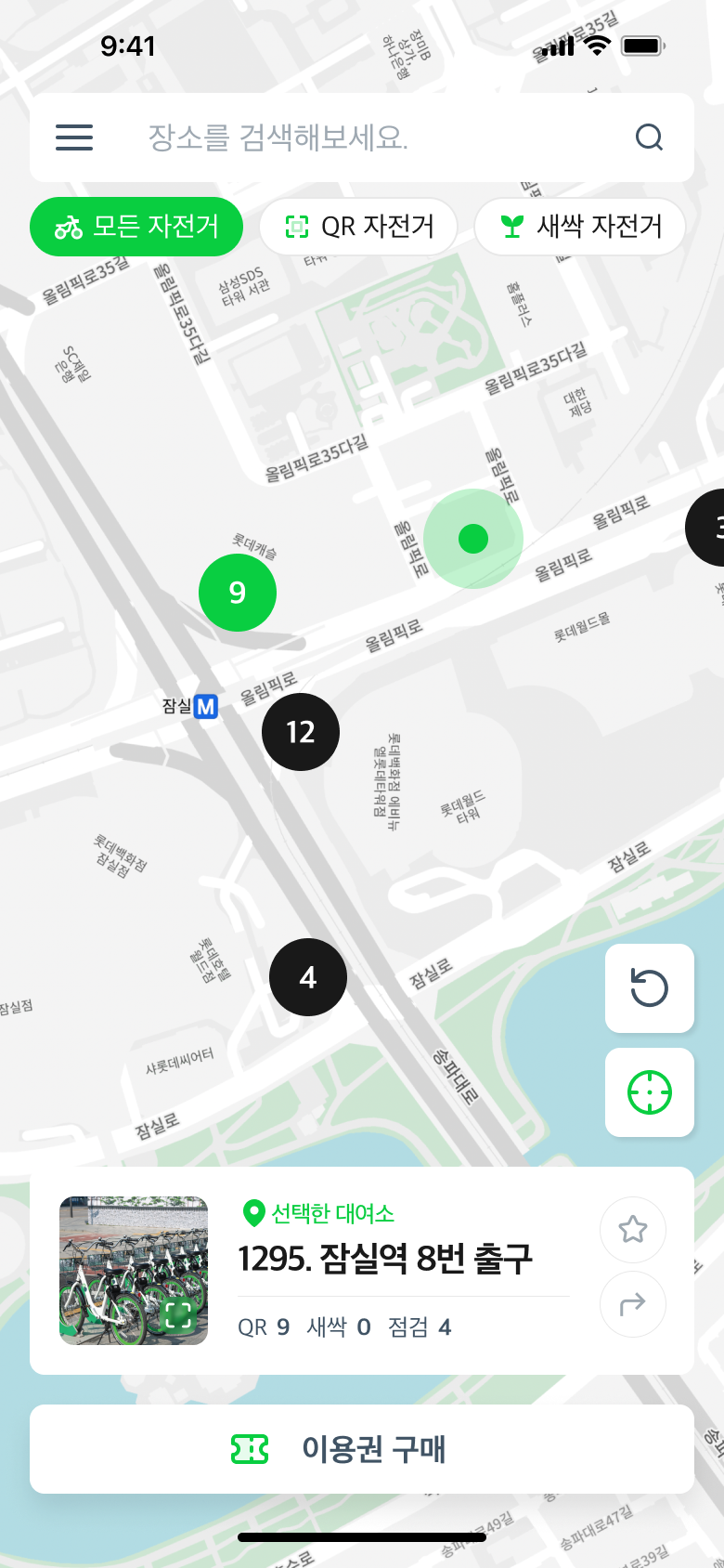
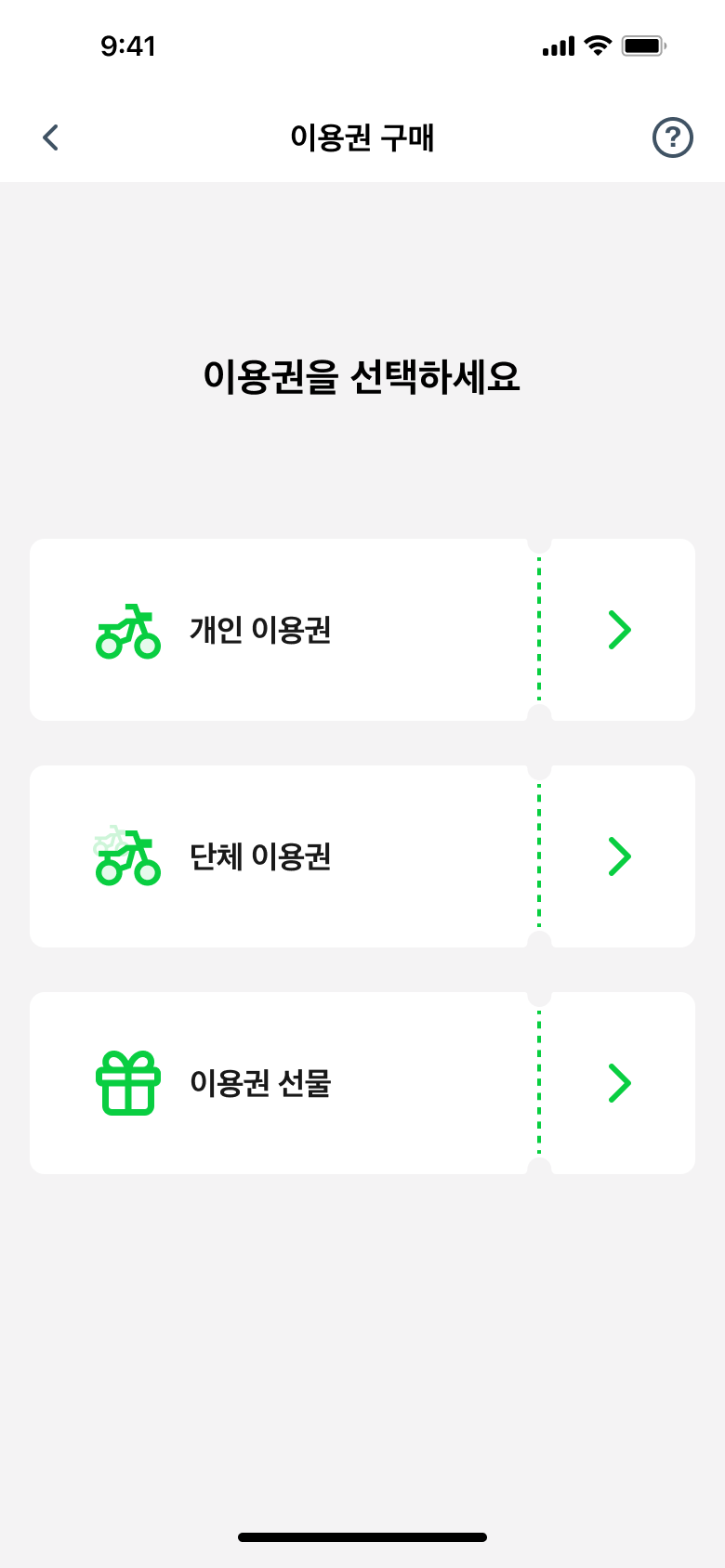
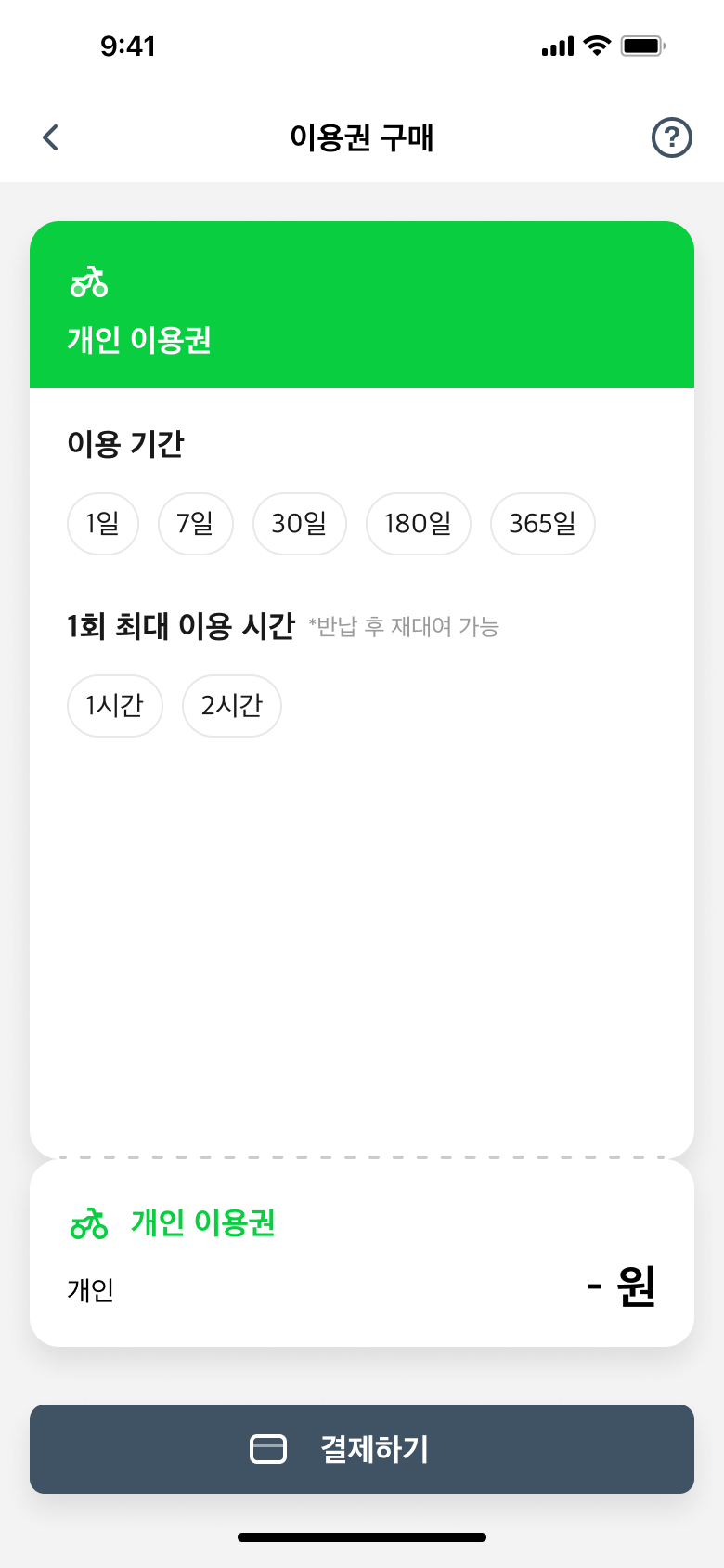
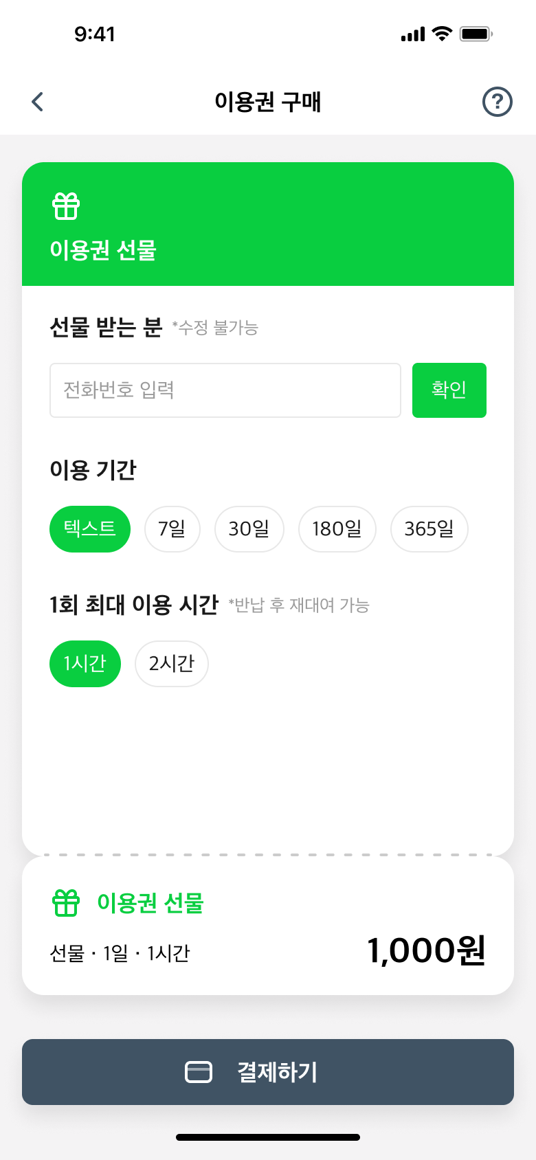
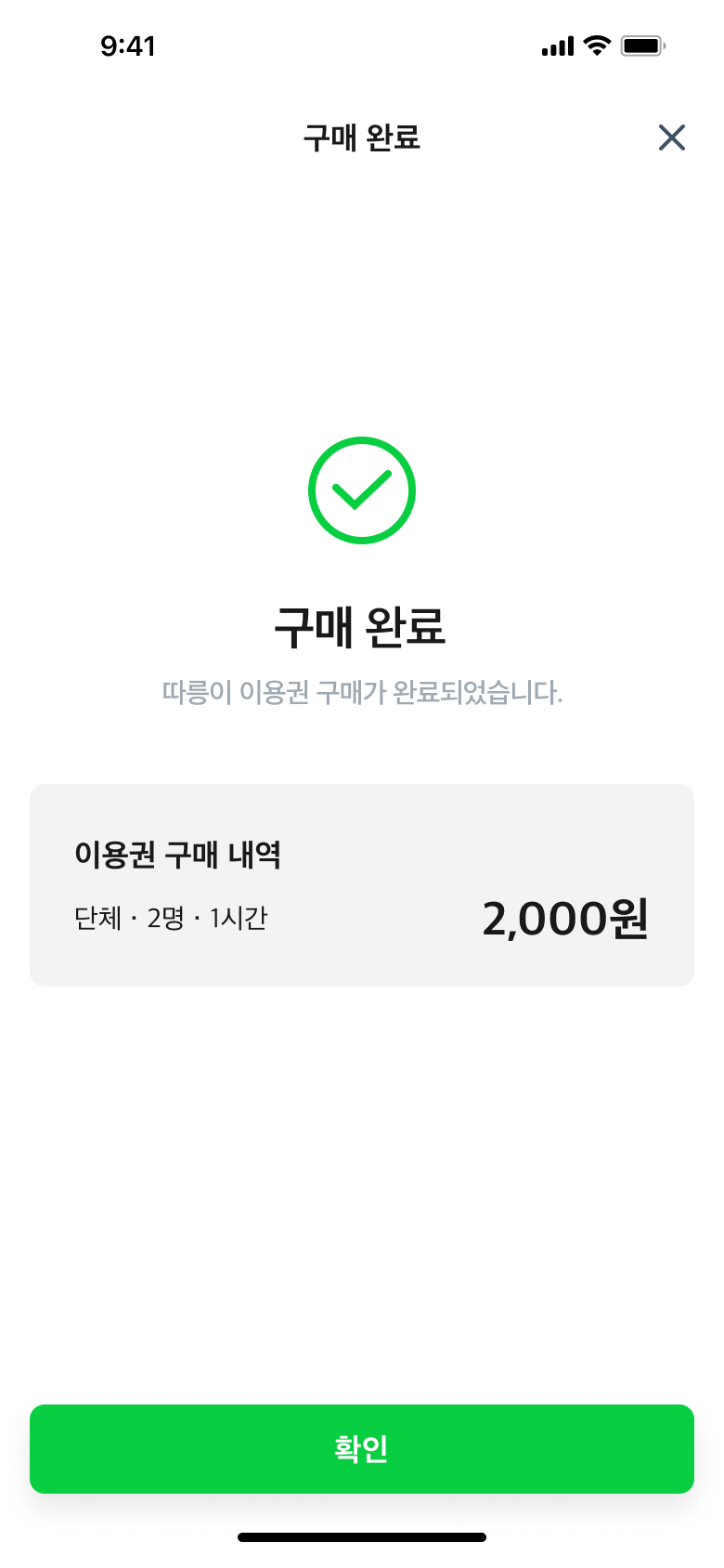
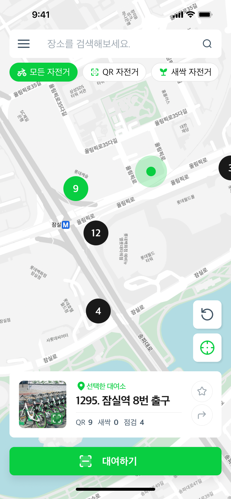
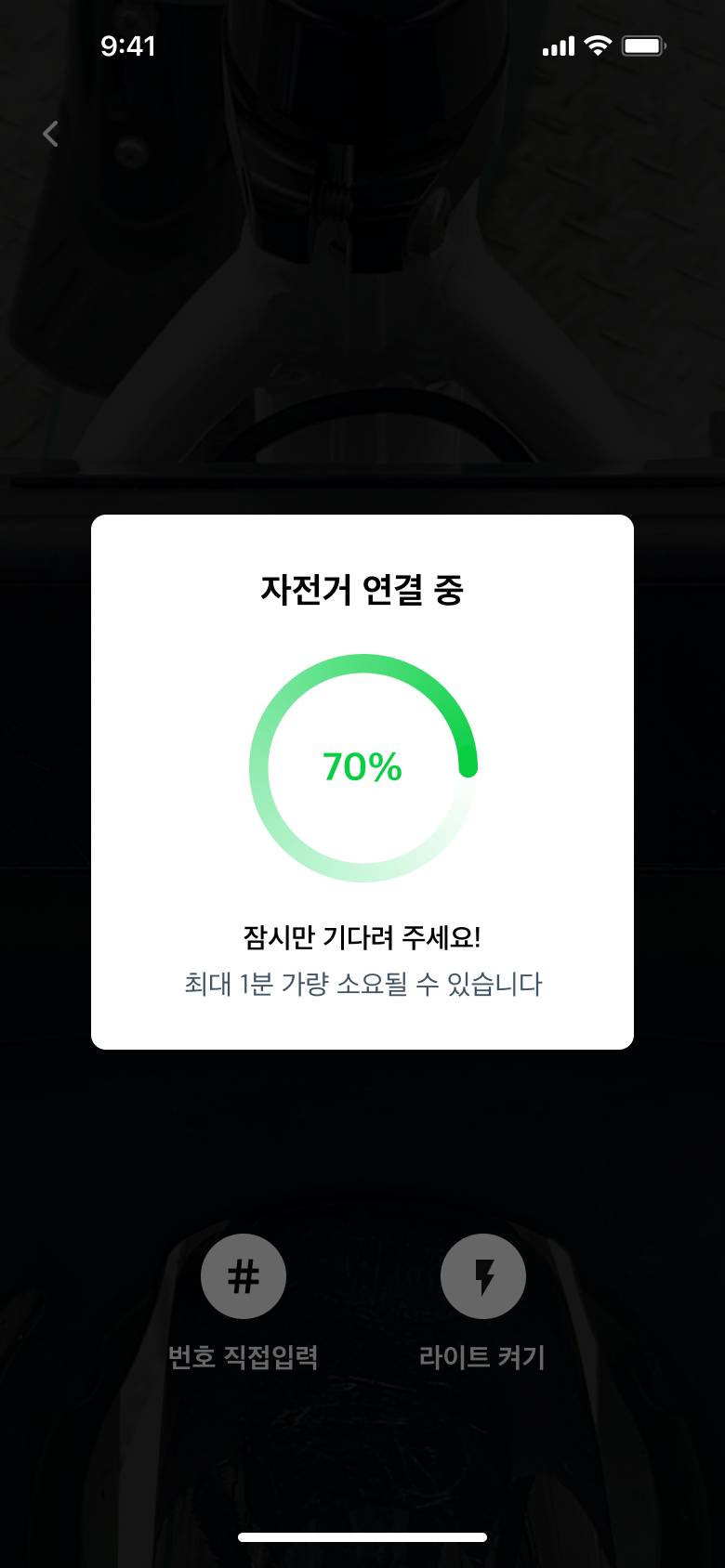
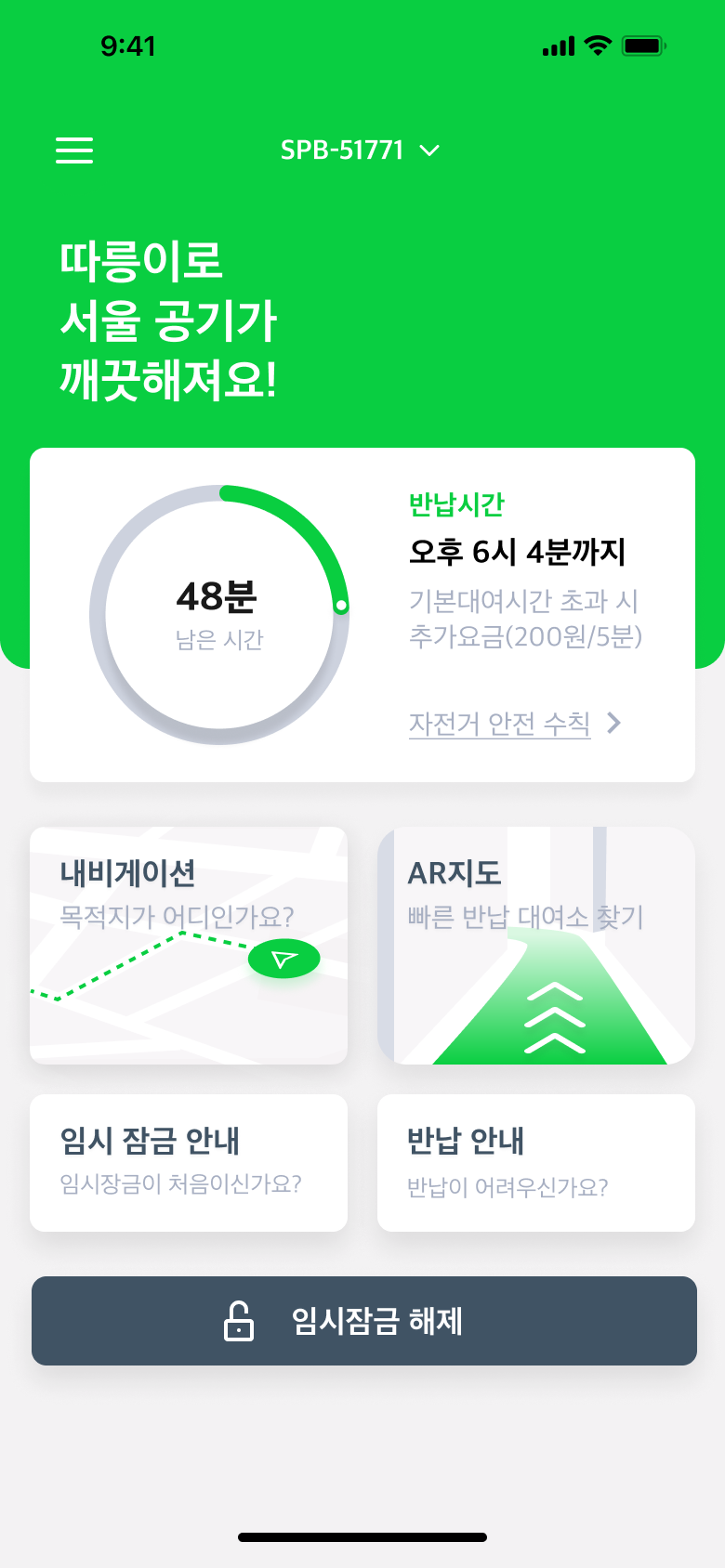
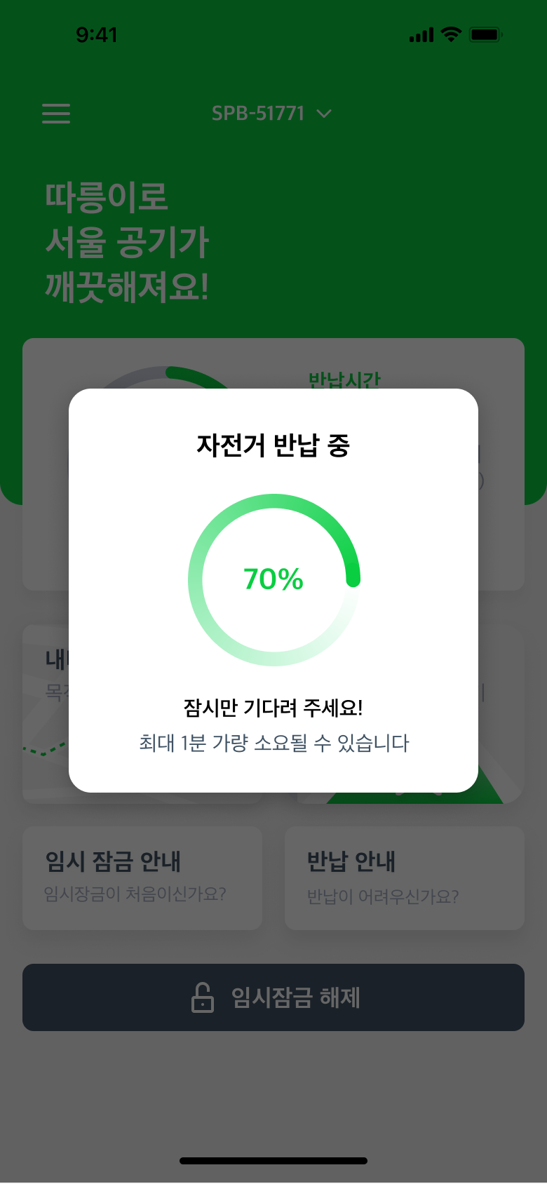
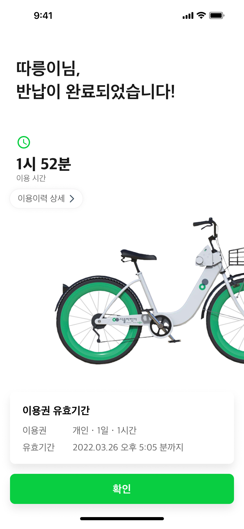
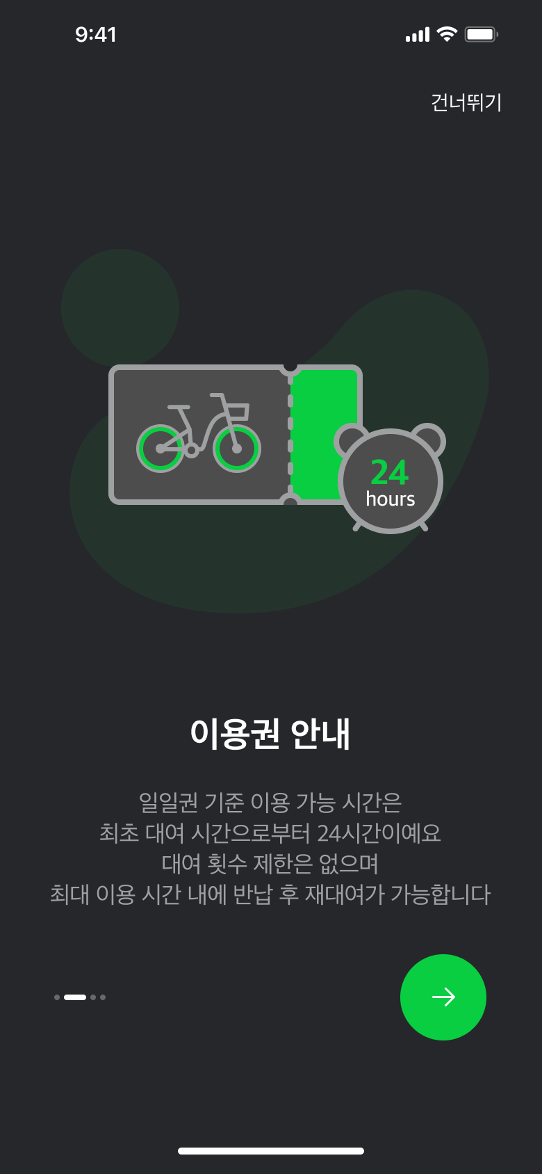
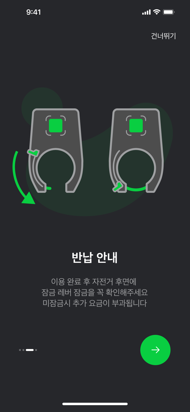
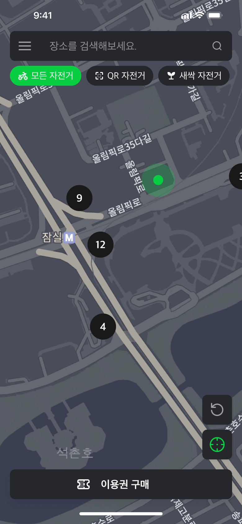
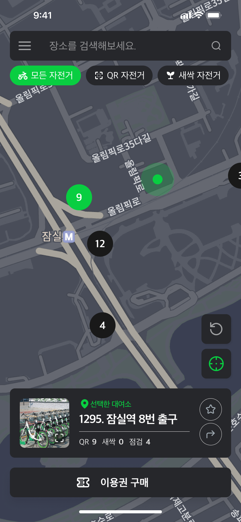
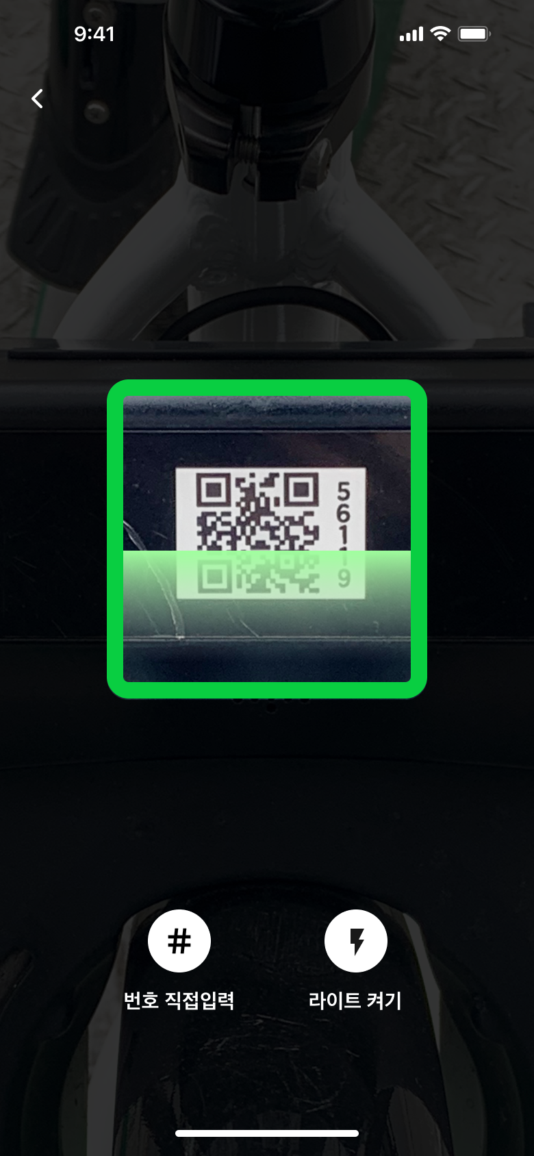
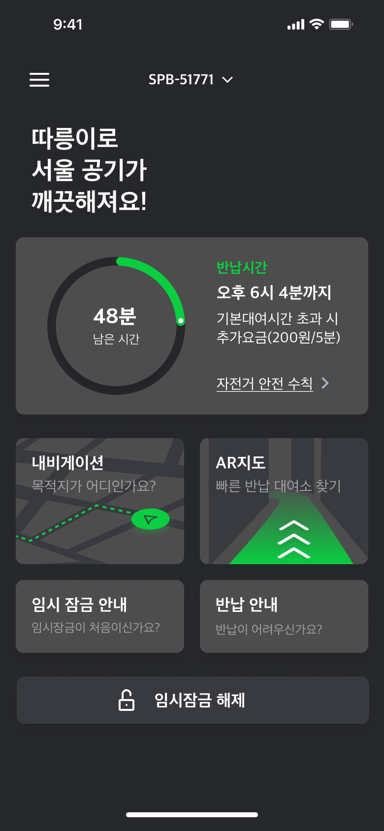
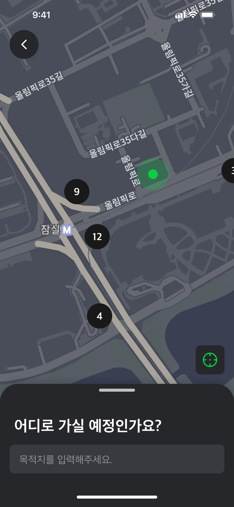
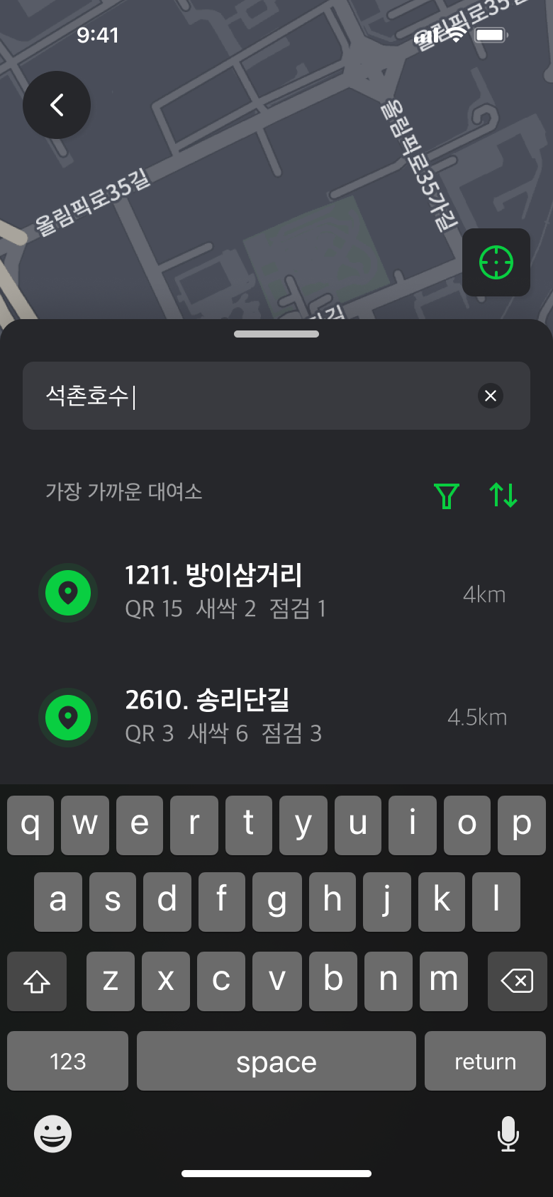
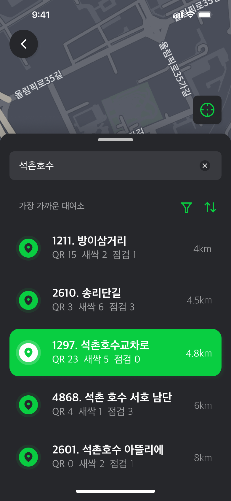
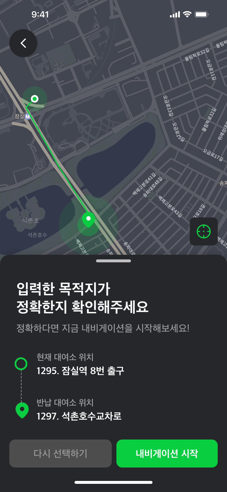
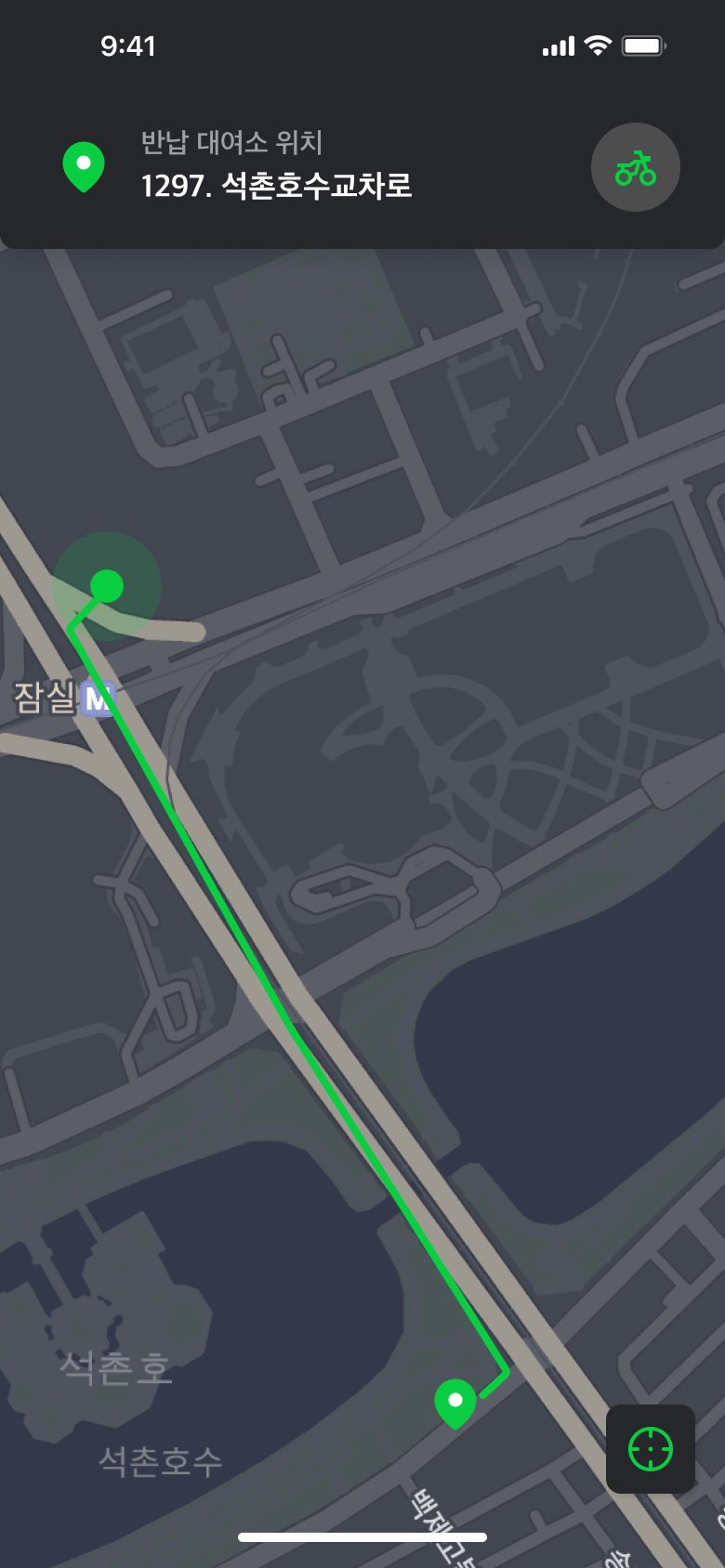
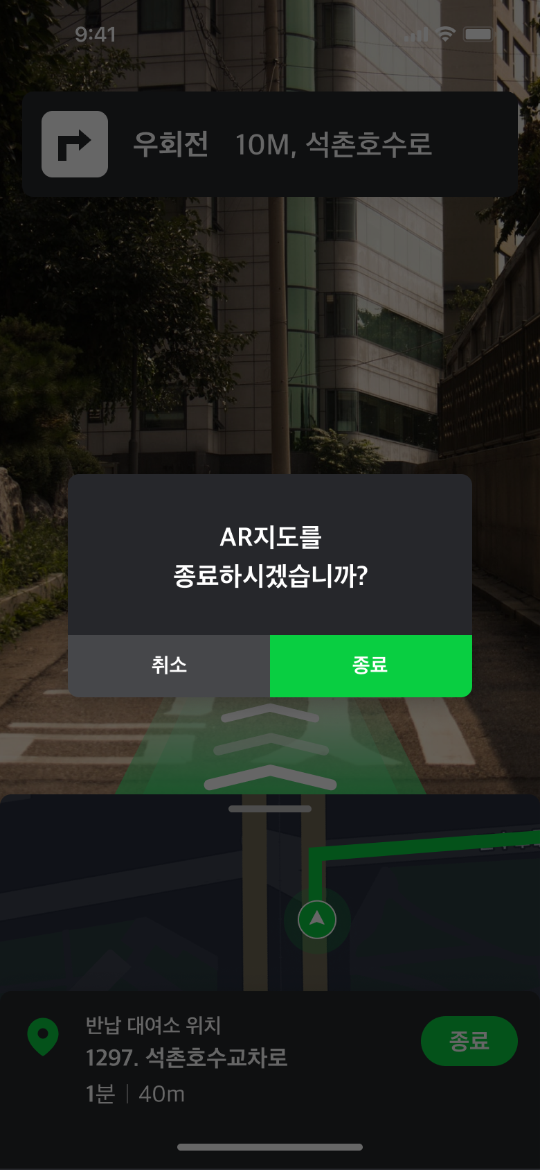
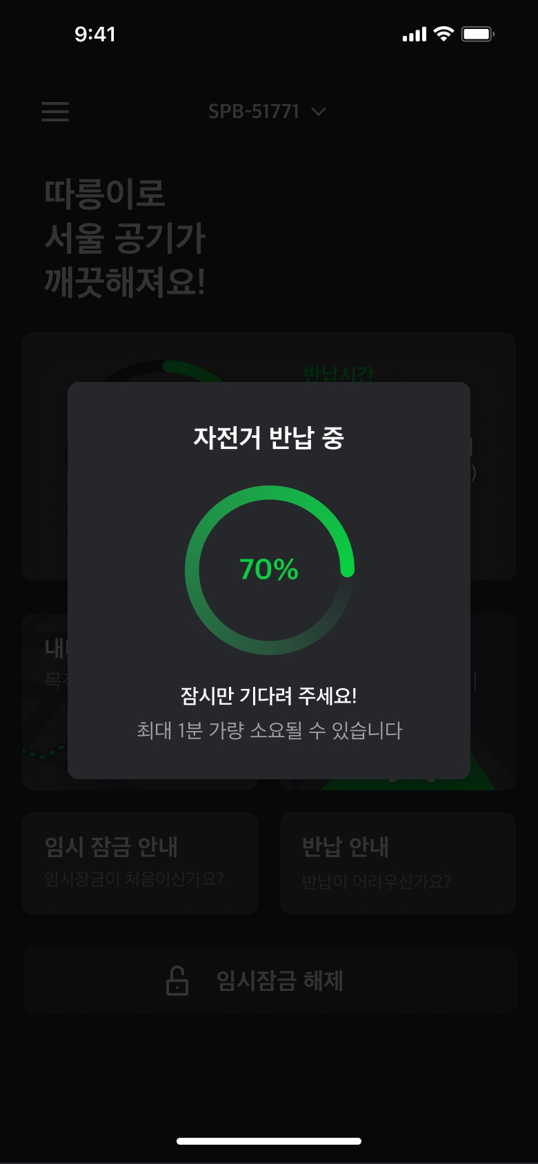
Even though it is a service used by a large number of the Seoul population, there were inconveniences as a user while using the official Seoul Bike app. To solve this, we proposed new features and worked on improving the user experience.

Task

Improving the usability and interface of an existing service

  • Strategy

    Usability evaluation, Personas

  • Design

    UX/UI

  • Team

    Ji-hyeon Kim, Su-hyeon Park, Yeon-su Lee

Seoul Bike is a public bicycle app operated by the Seoul Metropolitan Government.

Background

It aims to promote the use of bicycles as a means of everyday transportation, thereby contributing to a healthier society and enhancing the quality of life for its citizens.

Seoul Bike, Seoul's bicycle sharing system, began its pilot operation in 2014 and has since become widely used throughout Seoul, to the extent that these bicycles can now be seen everywhere in the city. Although significant efforts have been made and most services have improved, there are still shortcomings in the app's usability.

Therefore, we chose this as an app to improve through an in-class project, not only to solidify its brand position but also to enhance its flow for a more user-friendly experience from the perspective of its users.

Objectives

The goal of this project was to critique the Seoul Bike app and propose a new design to enhance user experience.

Ease of use

To ensure that even first-time users can easily use the app

Improved UX

Revise inconvenient aspects and new features to address issues

Improved UI

Improve usability through the unification of the overall GUI

Product Analysis

Before asking users about their experience using the Seoul Bike app, we took a look into the design elements and analyzed its usability and consistency.

Unexpected interactions

Upon touching the menu on the top-left corner, the whole page was pushed from right to left. Closing the menu made the same interaction.

Poorly aligned elements

The elements in the home screen were poorly aligned and designed. The color difference of pin markers weren't indicating the information needed.

Inconsistent use of color

Colors and sizes used in buttons and icons weren't systematically guided. This was seen throughout the entire application.

Unorganized UI components
Content text
Low visibility of contents

Text sizes of important information were small and unrecognizable.

User Persona

We surveyed and interviewed users to gain a better understanding of pain points and needs. The results were then cumulated to two user persona.

Sieun Yu

Age

25(F)

Job

Part-timer

Info

Prefers planned commuting
No driving license

Scenario

Living not far from work, she often use public transport for commuting. Recently, a Seoul Bike rental station opened near her home, so she bought a subscription. Whenever she visits an unfamiliar neighborhood on the bike, it is hard to find the exact location for return.

Needs

Quick login and usage
Subscription plan
Easier way to find bike return spots

Sejin Han

Age

40(M)

Job

Developer

Info

Terrible with directions

Scenario

He enjoys using the Seoul Bike for a change of mood during his commute, but as someone who often gets lost, he frequently has to check the map. He wishes there was a navigation feature to make this process easier. Additionaly he had payed extra fees several times due to issues with return.

Needs

Station-to-station navigation feature
User friendly returning process

Design

Colors, typography and icons were adjusted to better present the service.

Colors

We added vividness to the original colors of the Seoul Bike to enhance visibility and brand presence.

#09CE41
#002B3D
Typography
Icons
Screens
Light Mode
Splash

A walkthrough guide was added to the app to help new users understand how to use the service.

Spalsh
Walk Through
Main Screen

Unnecessary elements were removed from the existing main screen, and it was redesigned with a more intuitive and familiar user interface.

Home
Current Location
Station Info
Tickets

The process of purchasing passes was simplified to allow users to easily select and buy their desired pass.

Choose Ticket
Invoice
Renting

A new QR scan and number input screen was designed to provide a consistent visual. Pop-up interfaces were also systemized to be utilized throughout the app.

Connect
Success
Dashboard and GPS

A dashboard screen was designed to provide important information and features.

A graph was used to inform the remaining use time intuitively, and a GPS navigation feature was introduced considering the needs of users.

Dashboard
GPS
AR Map

An AR map was added so that users could find the return station more quickly and easily.

AR
Return

목적지 근처의 대여소 위치를 확인하고 대여소 to 대여소끼리의 길 안내를 통해 주행이 수월해진다.

Return
Dark Mode
Back